Simple tips for building a website that converts for you kite resort, heliskiing operation, backcountry skiing lodge, outdoor guide service, surf resort, mountain bike tours, or fly fishing lodge.
In today’s day of travel discovery starting online, you need a website that clearly shows customers what they can expect when they buy one of the trips you offer. Current stats show that over 90% of travels start their travel research online, and 82% will end up making their bookings online as well*. Now, some of that data is skewed by booking flights and hotels online, as that has become common practice. But if you’re still thinking your website doesn’t matter to a customer who is considering your experience, you might not be so convinced in the near future. This behavior is likely to continue and accelerate, rather than slow down.
Your website may have one of the largest impacts on a customer’s decision to book with you or with a competitor, ranking right alongside responsiveness and friendly personal interaction and a word of mouth endorsement from a friend or colleague. How you show up online is incredibly important, and your website is the anchor of your online presence.
It’s not as hard as it sounds, or expensive
Start simple. You have to hit the basics, and that doesn’t require much. The three most important things to consider are the following:
- Imagery and visual design
- Good organization and easy to understand products or offers
- Clear action steps
You’d be surprised how many sites are truly missing the mark on these simple best practices. Let’s look at each one in a bit more detail.
Images are a critical piece of any outdoor adventure company website
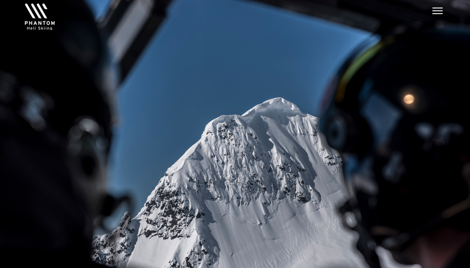
Images and video will be what sets you apart from competitors. These photos that tell a story about what customers can expect when they book your experience will be far more valuable than anything else you do with your website. Furthermore, your images cannot be sequestered to a gallery on a separate page. They need to be fully integrated into the information on each page. Meaning, you need to explain aspects of the experience and have that visually aligned with appropriate images.
Large, full bleed images that take over the entire screen are ideal for outdoor adventure websites in today’s modern age. Images for outdoor adventure experience providers generally fall into a few categories, and you should have a mix of all three of these on your site.
- Immersive
- Experience Focused
- Emotional
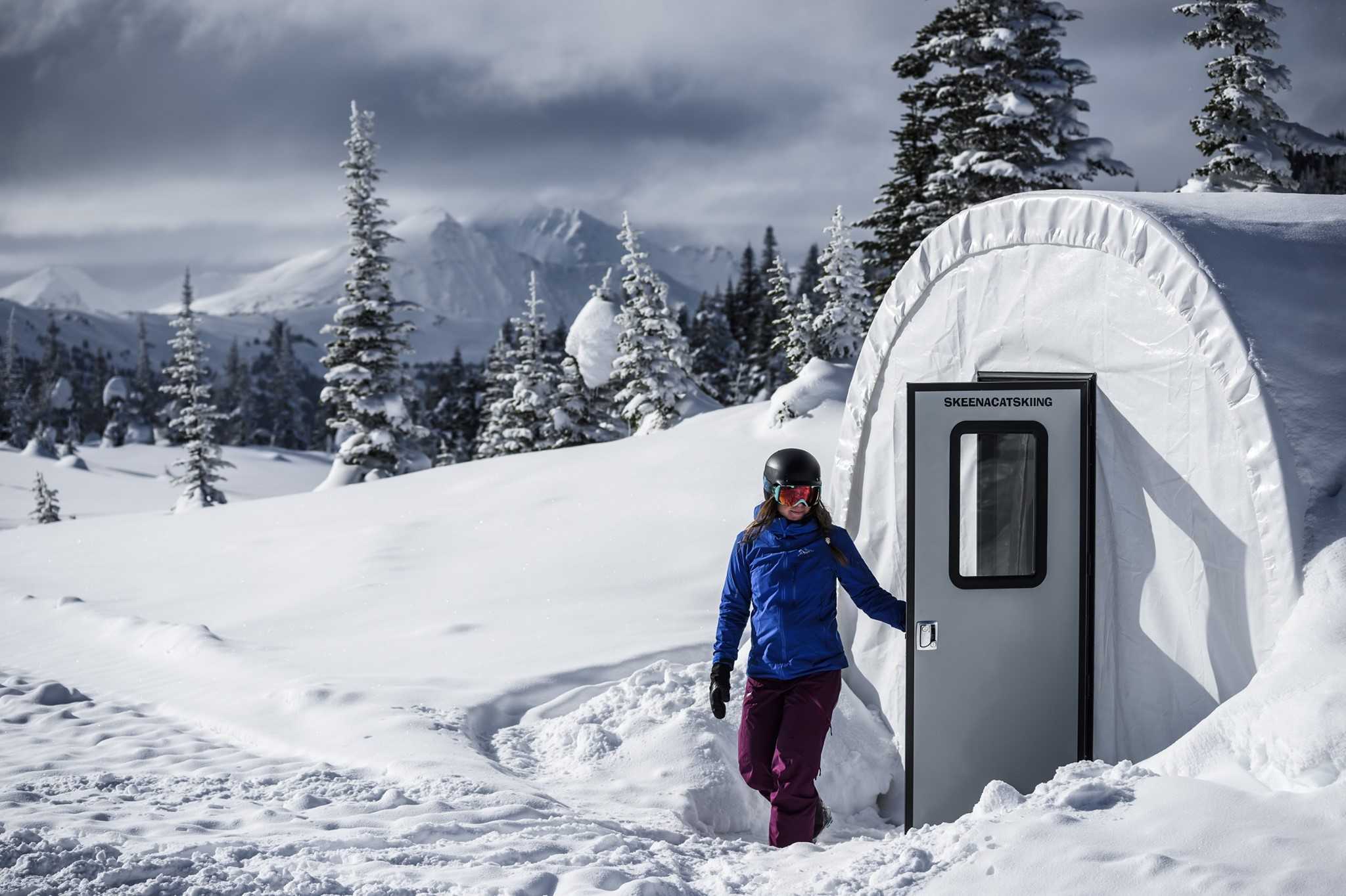
Immersive photos are typically wide panning landscape shots. Your location and the surrounding area are what will help transport viewers from their living room to your location. Drone shots, aerials, and wide view landscape shots all fall into this category.
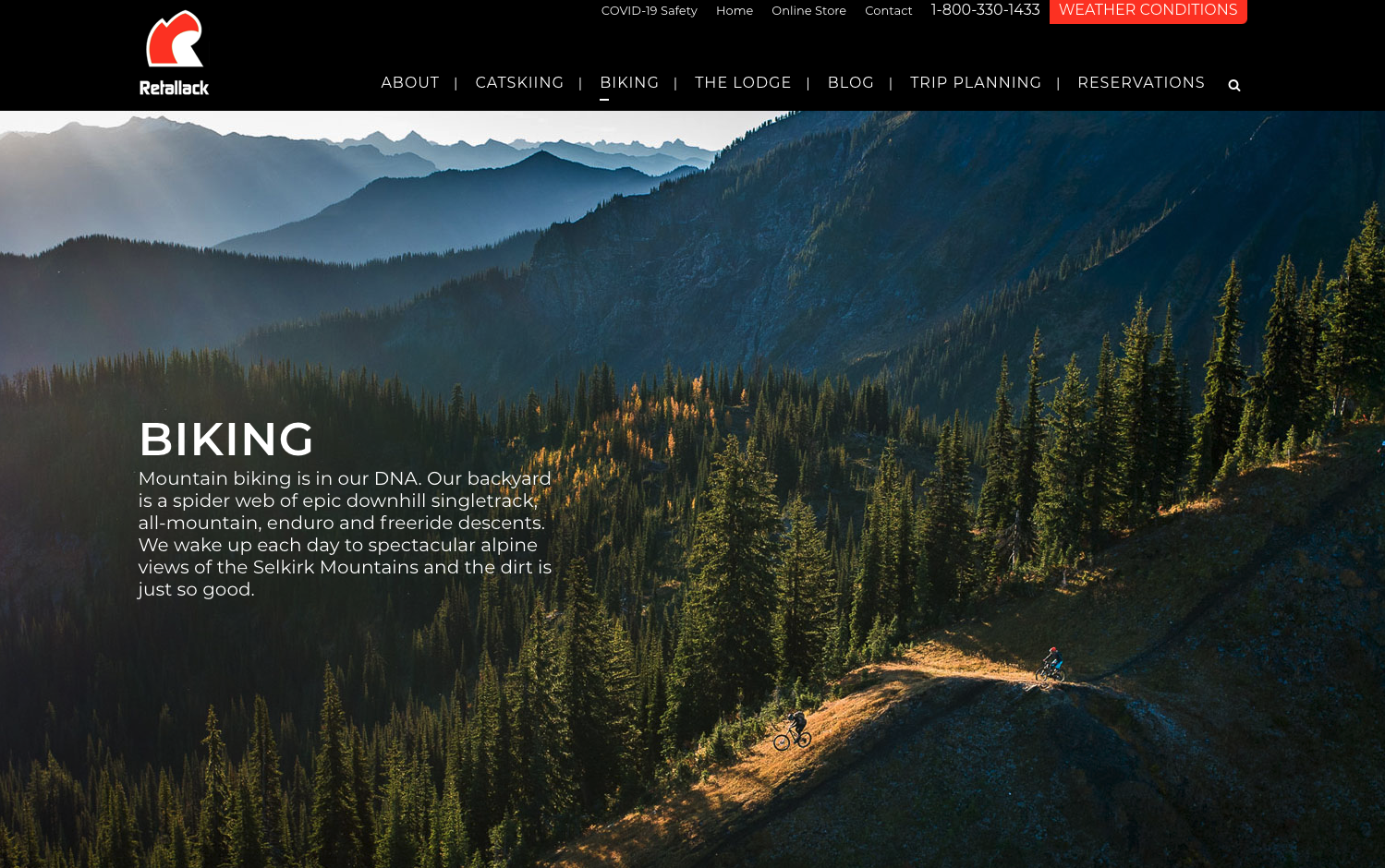
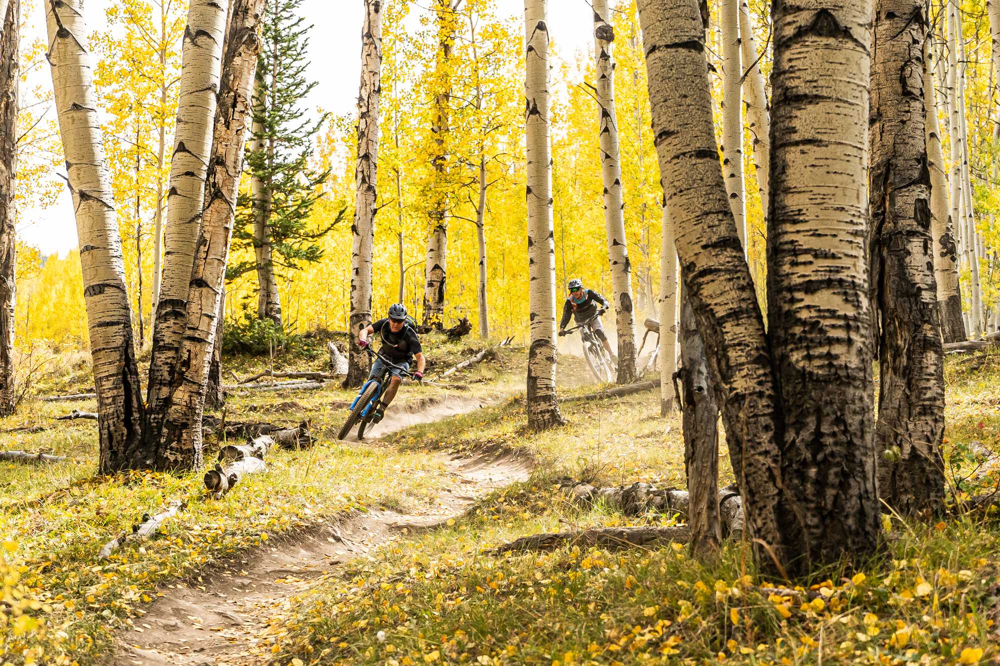
Experience focused photography shows what activities a guest can expect. For every activity or selling point you offer, you should have accompanying photography. Guests get to ride to and from the location in a tricked out overland vehicle, that needs an image. You have a 5 star chef on site preparing incredible food, that needs a photo. Your spa offers a wide range of services on location, that needs a visual. And let’s not forget, action shots of any sport or activity you offer should be plentiful and peppered throughout your site.
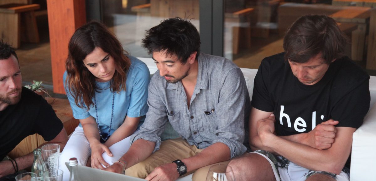
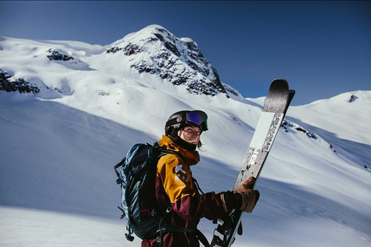
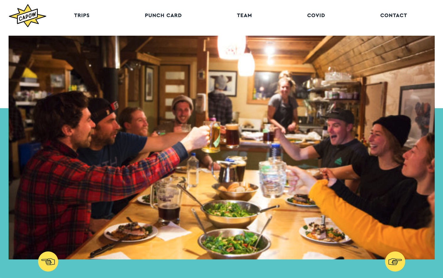
Emotional shots are just as important. Without the faces of guests and staff enjoying themselves, a website can feel devoid of life. You don’t need models, regular guests will do. Your staff also can serve as subjects for photo shoots. The job of these photos is to capture the feeling of your amazing place.
If you can step this up with high quality video, that is even better. It also goes without saying, there is a big difference between professional and average photography. Be sure to hire a photographer to supply you with a full library of photo assets for use on your website and social media channels. Just be sure that they capture all of the above, and have a clear shot list of what needs to be photographed.
Here at Heli, we have several professional photographers on staff. If you and your team need photography assets, hit us up at team@heli.life. Often, we can help you capture these kinds of photos during a FAM trip.
Site Organization, Thematic Sections and Easy to Understand Packages or Products are Critical
You’ve probably got a lot to tell people about your adventures. But, there is a big difference between what you would communicate to a customer over the phone or throughout the purchase process, and what you should have on your website.
SIMPLIFY
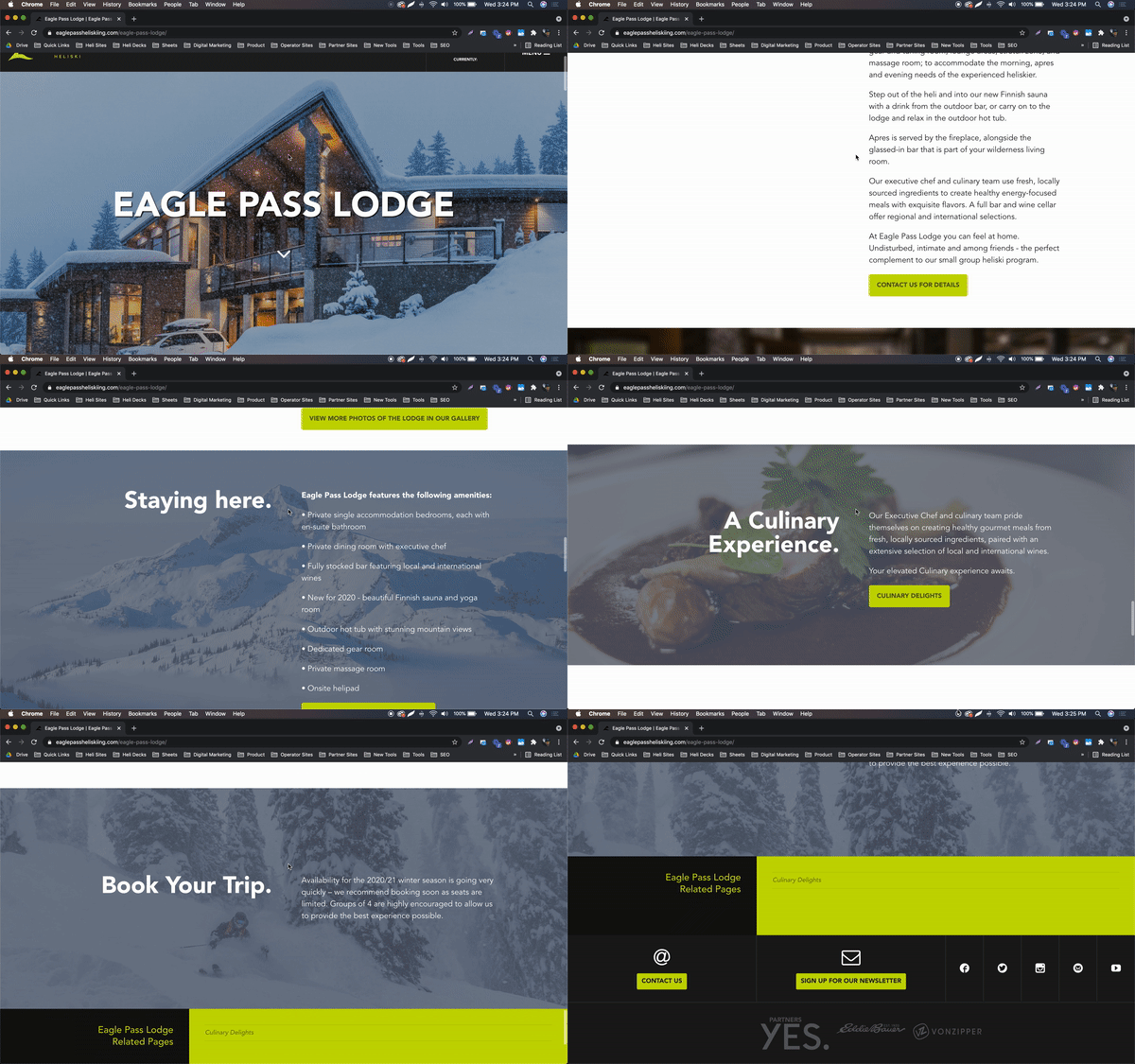
The website is often someone’s first introduction to who you are and what you offer. If you overwhelm them immediately with options, information and logistics, you’ll lose their interest. Your site should be well organized, be broken out into themes, and have your product offering (dates, price, inclusions, availability) clearly visible.
Here are some general guidelines that we provide to our partners:
- Have a simple menu that covers the basics. Contact us, Packages, About/Info, Booking Policies, Location/How to Get Here.
- Have a new page for each package type. Clearly state what is included, trip length. If you tend to do a lot of custom trips, have a base package and then explain that customization is possible, but don’t try to lay out all the pricing and options in the package description. Keep it simple.
- Have templates and group things into themes. Have clear space and visual breaks between subjects on a page. Make sure each section has headline text. This will all help make the page more skimmable and easy to find the information that is relevant to the customer.
Ultimately, a simple website may take you much further than something complicated and jam packed with more information than the guest needs. You may have a lot that you want to communicate to potential new guests, but the key to a great website design is how much you can reduce this down into something simple and clear.
Ensure your site has clear action steps, or risk losing visitors
On every page of your website, it should be clear what is the next step a visitor should take. All pages on the website should lead toward an action that brings someone one step closer to booking with you. What does it take to get someone from a window shopper to ready to purchase. Usually, it is one of the following:
- Get visitors on the phone
- Get visitors communicating with you via email
- Get visitors viewing dates, prices, availability (aka shopping)
- Get visitors chatting with you*
- Get visitors signed up for your email list or following you on social media if now isn’t the right time for them, but they want to keep you in mind for the future.
Let’s break down each one of these actions steps in a bit more detail.
Get visitors on the phone
Have your phone number clearly visible in the top and bottom of your website. On specific pages, where you feel that talking to guests will be important after they have read specific information, give them a reason to call. For example, on your “How to Get Here” page, have a section at the bottom that says “Need help planning your arrival and departure? Contact our team today” with your phone number in large text.
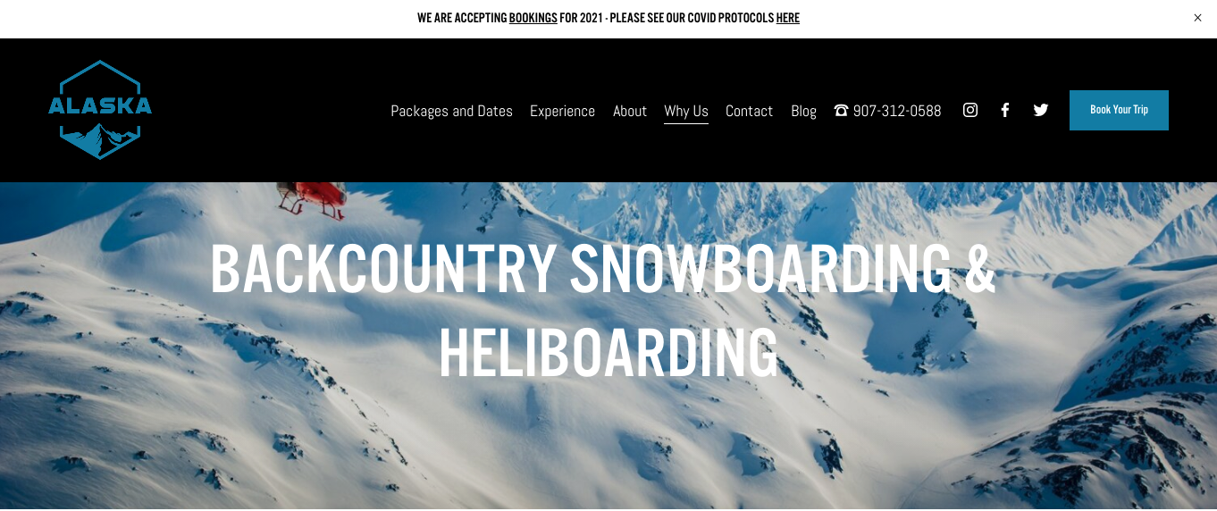
Get visitors communicating with you via email
Make Contact Us an option on your main menu. Have a form that guests can complete which comes directly to your email. Have selections that help guests out in choosing a topic for their email. Don’t be afraid to ask them for additional information about themselves and their group when filling out a contact form. It will help you better understand and address their inquiry.
Get visitors shopping – and booking
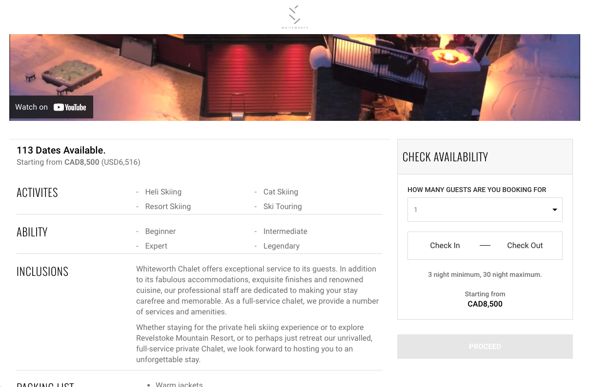
Book Now buttons should be one of the most prominent features on your site. This is the most important action step, and you want it available everywhere. When someone decides they want to book with you, you should never make that step difficult.
Once a guest decides they want to book with you, they will need three basic questions answered. What are the dates, what is the price, is the timeframe I want available. If you can answer these questions for the guest, most will be willing to put down money to secure their spot.
By using Heli OS, we lay all this information out clearly and allow guests to book online. You can choose if you want guests to book directly on your website once they click the book now button, or you can send them a link to book their trip after connecting with them via phone or email. Either way, guests clearly get the information they need and can pay easily online.
Get visitors chatting with you
This one is optional, and we talk more about the advantages of having a chat feature on your website in our article where to find new heliskiing customer online. But don’t let the title fool you, these tips are great for all outdoor adventure businesses. Chat and chatbots can be a great way to turn anonymous traffic into customer information that you can follow up on. Having a name, email and trips of interest can be a really powerful way to move people from consideration to sale.
Get visitors to join your email list or follow your social media
This one is to help capture those people who aren’t ready to book, but will consider you in the future. This is sort of the “on your way out” offer. Getting people to join your email list or follow you on social media will increase the chance of those visitors coming back in the future. It’s worthwhile to consider these as exit offers (using a popup from a third party software) or just having it clearly stated on your site. Make sure people know they can stay in touch, and clearly outline what you will give them. “Get early access to new inventory, special last minute deals, and exclusive content when you join our list. Be the first to know.” etc.
Looking for additional support on greeting a great web experience?
The team at Heli offers additional support services to help you make the most of your website. We can power your online booking and reservations, send our team to your location for photoshoots and video production, and even advise on web development and setup. Contact our team today to learn more.

